A Comparative Study on Form Factors in betweens the Designs of Mies van der Rohe and Luigi Colani
Copyright Ⓒ 2023 KSAE / 211-01
This is an Open-Access article distributed under the terms of the Creative Commons Attribution Non-Commercial License(http://creativecommons.org/licenses/by-nc/3.0) which permits unrestricted non-commercial use, distribution, and reproduction in any medium provided the original work is properly cited.
Abstract
Representative modernism architect Ludwig Mies van der Rohe and emotional curved form creative designer Luigi Colani evidently contrast in terms of their form factors and formal qualities of straight-flat geometric shapes. These were considered as functional forms and streamlined-organic shapes and were categorized as emotional form factored designs. In this study, observation and analysis had been carried out to clarify both of the designers’ common efficiency factors within their forms of objects by comparing backgrounds, major characteristics, physiognomy and design form structures. Based on the result of the study, it was discovered that Mies’s straight-flat geometric shapes and Colani’s streamlined-organic shapes both have principles of efficiency that are common for structures and functions were discovered as form factors. Although the organic designs with streamlined surfaced shapes looked to have more potential for emotion-oriented shapes with creative rather than geometric functional ones, both designers pursued common efficiencies in terms of structures and forms.
Keywords:
Form factor, Efficiency factor, Geometric design, Bio design, Functional design, Physiognomy1. Introduction
Ludwig Mies van der Rohe(1886 ~ 1969), original name Maria Ludwig Michael Mies is considered one of the representative architects of 20th century who crafted elegant simplicity, epitomized the International Style of architecture. And Luigi Colani(1928 ~ 2019), German-born Swiss designer is considered as whose curved streamlined forms, crafted elegant organic shapes, epitomized the Bio Design. Regarding for that, Mies never used curves or curved surfaces on his works, neither Colani never ever used straight lines nor flat planes. And they each created totally different works of one by standardized functional designs representative modern architecture developed with the curtain wall structure, and the other of emotional elegant designs with the organic design developed by streamlines.
Albeit the appearances of their works had contrasted with which seem to be rational or emotional, but both designers had innovative ways in creating their works. Incidentally, both had German backgrounds in their lives, but they did not live exactly same periods of times, and it may looks to have efficiency factor coherently which is one of the core factor of modern civilizations.1)
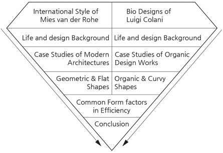
Therefore, this paper is purposed to clarify their contemporary ideas with the format of discussing on the commonalities in their geometric and organic designs. In the chapter II and III, their lives, backgrounds of their design ideas, design characteristics, and principles had been reviewed with selected works. Fig. 1 shows research structure of this paper, by which scopes of studies are as follows;
- - Designers’ lives and design backgrounds
- - Basic shape development concepts
- - Characteristics of each designs
2. Ludwig Mies van der Rohe
2.1 Life and Design Background
Ludwig Mies (he added his mother’s surname, van der Rohe, when he had established himself as an architect) was born in 1886 as a son of a master mason who owned a small stonecutter’s shop. Mies helped his father on various construction sites but never received any formal architectural training. At age of 15, he apprenticed at several Aachen area architects for whom he sketched outlines of architectural ornaments, which the plasterers would then form into stucco building decorations.2)
In 1905 at age of 19, Mies went to Berlin to work for an architect but soon left the job to become an apprentice with Bruno Paul, a leading furniture designer who worked in the Art Nouveau style of the period. Two years later he received his first commission, a traditional suburban house. Its perfect execution was impressed Peter Behrens, then Germany’s most progressive architect, that he offered the 21-year-old Mies a job in his office, where at about the same time Walter Gropius and Le Corbusier were also just starting out.3)
According to the contents of the book of Stanislaus von moos, Peter Behrens was a leading member of the Deutscher Werkbund, and through him Mies established ties with this association of artists and craftsmen. The Werkbund’s members envisioned a new design tradition that would give form and meaning to machine-made things, including machine-made buildings. This new and “functional” design for the industrial age would then give birth to a Gesamtkultur that is, a new universal culture in English, a totally reformed man-made environment. These ideas motivated the “modern” movement in architecture that would soon culminate in the so-called International Style of modern architecture.4)
One decade later in 1930, Mies was appointed to director of the Bauhaus, which was a bit later of the its moving from Weimar to Dessau in 1925. Between Nazi attacks from outside and left-wing student revolts from within, the school was in a state of perpetual turmoil. Though not cut out to be an administrator, Mies soon won respect as a stern but superb teacher.
When the Nazis closed the school in 1933, Mies tried for a few months to continue it in Berlin. But modern design was hopeless in Hitler’s totalitarian state as was political freedom. Mies announced the end of the Bauhaus in Berlin late in 1933 before the Nazis could close it.5)
2.2 Design Ideas and form Factors
For designs, Mies was influenced by Behrens’ idea of the pure, bold and simple neoclassic forms of the early 19th-century German architect Karl Friedrich Schinkel during his Berlin days in 1910s. Throughout his life, the elegant clarity of Schinkel’s buildings seemed to Mies to embody most perfectly the form of the 20th-century urban environment.3)
An interesting point from the references, is that Mies’s father was a master mason of traditional decorative style stone architectures, but it is found that Mies himself never ever used any decorative ornaments as form factor on his building designs.
Another decisive influence was from Hendrik Petrus Berlage, a pioneer of modern Dutch architecture, whom Mies met in 1911. Berlage’s work inspired Mies’s own love for brick, and the Dutch master’s philosophy inspired Mies’s “architectural integrity” and “structural honesty.” With regard to structural honesty, Mies would eventually go further than anyone else to make apparent or dramatized supports of his buildings their dominant architectural features.3)
2.3 Developments of Structural Character
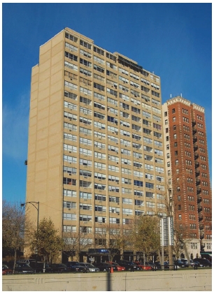
The many commissions that his architectural office received after the World War II gave Mies unique opportunities to realize large-scale projects, among them several high-rise buildings that are conceived as steel skeletons sheathed in glass curtain-wall facades. Among these major commissions are the Promontory Apartments in Chicago-1949(Fig. 2), the Lake Shore Drive Apartments-1949 ~ 51 in that city, the Seagram Tower-1956 ~ 58 in New York City, and a skyscraper office building with a glass, bronze, and marble exterior that Mies designed with Philip Johnson.6)
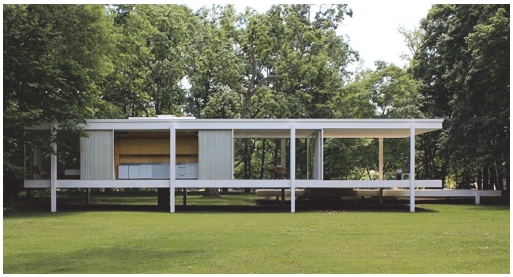
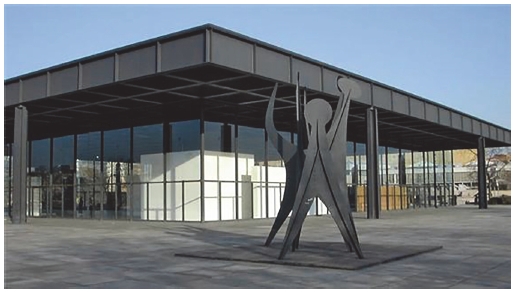
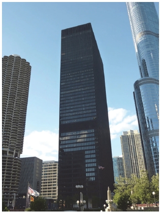
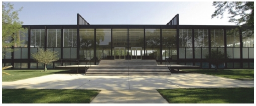
Also during this period, Mies applied his modernist aesthetics to three more-intimate structures, the Farnsworth House in Plano, Illinois completed 1951(Fig. 3), the Robert McCormick House in Elmhurst, Illinois completed 1952; now part of the Elmhurst Art Museum, and the Morris Greenwald House in Weston, Connecticut completed 1955. In the 1950s, Miesian-influenced steel-and-glass office buildings appeared all over the United States and indeed all over the world. In the 1960s Mies continued to create buildings, among them the most Miesian of all is the Gallery of the Twentieth Century-later called the New National Gallery in Berlin, dedicated in 1968(Fig. 4). And the IBM Building in Chicago(Fig. 5) was completed in 1972 after his death in 1969.7,8)
Most of the Mies’s buildings exemplify his famous principle that “less is more” and demonstrate, despite their austere and forthright use of the most modern materials, his sense of proportion and his extreme concern for detail. The International Style, with Mies its acknowledged leading master, reached its zenith at this time. The design factor of the International Style architecture is summarized in terms of space volume, use of mass-produced industrial materials, rejection of all decorations and colors, repetitive modular form, and use of a flat surface made of glass.9)
3. Luigi Colani
3.1 Life and Design Background
Luigi Colani was born on February 8, 1928 and his father was from the Italian part of Switzerland, worked as a film architect in Berlin, and his mother was from Poland. After school Luigi went four years to the Academy of Art in Berlin to study painting and sculpture. According to himself his most important qualification is, that he is able to think and draw in a three-dimensional way that learned from the Academy.10)
At age of 19, Luigi went to France dreaming about a job in the design studios of one of big automobile manufacturers, but landing at the “Propag” bureau run by the late Jean Terramorsi, who later became racing director of Renault.10) As mentioned in the contents of Bech, John, his office was doing the Ford-magazine “Revue Vedette” and Luigi did lay-outs and drawings for the magazine and the Ford factory. His drawings were also published in “L’Automobile” magazine, where they were noticed by Michel Gautier, who was racing manager of Simca. He sent Luigi to the small town Evreux and told him to build there the first French fiber glass car.10)
Luigi also worked on a car project with Baron Dupouget, who was the vice-president of the A.C.O. motor club organizing the Le Mans 24-hour race. Also with Charles Deutsch and René Bonnet, Luigi worked together. During his years at France, Luigi started to study aerodynamic at the Paris University and realized importance of the aerodynamic in cars and aircrafts. After the ten years in France, Luigi came back to Berlin to start to work at the coachbuilding firm “Erdmann & Rossi”. Later he set up his own small workshop in Berlin and started to build up sports cars and prototypes.10)
3.2 Design Ideas and form Factors
According to the interviews by chief editor of CarStyling magazine Akira Fujimoto in 1978, Colani indicated his opinion for his design concept as ‘bio design’ and noted that nature is the best designer, and the laws of nature are the source of his inspiration of design works.10) The interview contents reveal that he dealt with the concept regarding organic shapes mainly rather than bionic mechanism of living.
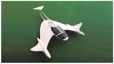
When Colani is designing his sports- and racing-cars, aerodynamic was the rule. With the context, his curved form principle is rule to build the car body with the shape of an inverted wing profile. The main characteristics of his forms can be analyzed as streamlined, sharp edges, directional shapes for movement, and tensional surfaces derived from the body structure and posture of the organisms to increase the efficiency of movements. All these concepts were derived from features of organisms of which is as a result of evolutions to reduce resistances from the environments of air or water, and appeared coherently on all Colani’s works.11)
3.3 Dev elopment f or Functional Shapes
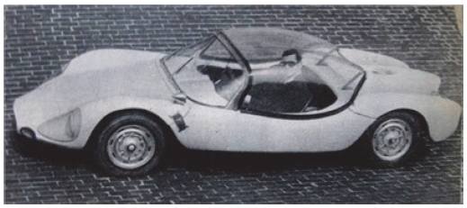
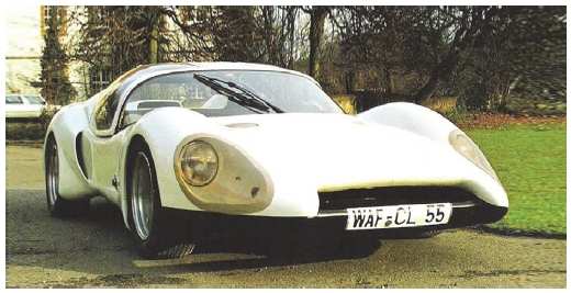
In 1955 Colani built a 4-seater prototype with streamlined body, and between all the Colani drawings and prototypes, one car in 1962 actually went into a successful production, which was the Colani GT spider of 2-seats and fiberglass body on the generic VW floor pan(Fig. 6).
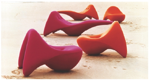
It was sold as a kit for do-it-yourself people and around 500 kits were produced. During those years in Berlin, Colani also designed new shoes for the famous fashion houses in Paris and one year he won Golden Shoe prize of Paris. And in 1968 Colani opened his own design-firm and s tarted to work very close with the furniture industry doing many production models for German firms. The organic shaped living room couch in 1968(Fig. 7) as reminiscent of the modern sculptures of Henry Moore had been evaluated that govern any environment in which they are placed.10)
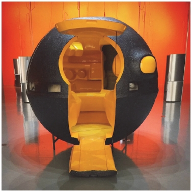
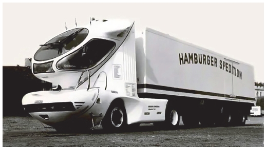
In that period, he also built sphered shape secretary working unit, and spherical kitchen unit(Fig. 8). Both have geometric sphere shapes but could be considered that designed based on organic ideas such as embryological process of life organs in their form factors. And Colani presented a New lorry 2001(Fig. 9), which completely stole all the attention at Frankfurt the IAA(International Auto Ausstellung) in 1977 with the tractor unit of streamlined futuristic shape cabine.10) Also in this period, Colani began to design airplanes and space ships on the bases of his aerodynamic study background.
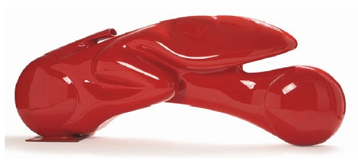
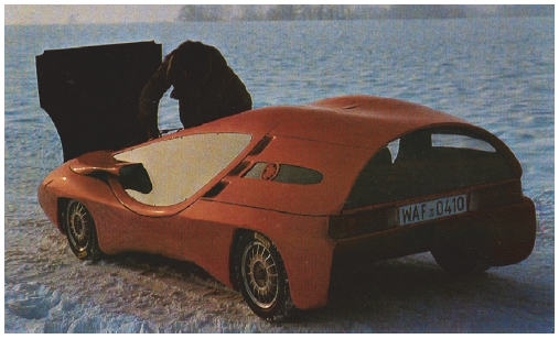
With applying aerodynamics, he designed and built Frog bike which have organic form derived from body shape of frog(Fig. 10). Also he presented VW Polo prototype(Fig. 11) recorded the best aerodynamic Cx-figures as a 4-seater saloon ever registered from the test firm. The Colani Polo showed extraordinary 0.35 Cx which was the ever best figure for VW production passenger cars of only 0.37 Cx developed until 1976.10)
4. Discussions on the Form Factors
4.1 Curtain Walls and Appearances
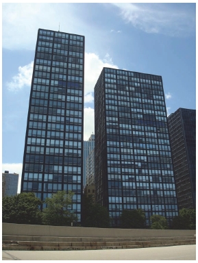
The Curtain wall is one of the most important aspect of Ludwig Mies van der Rohe’s architectural designs.12) Mies firstly began prototyping the curtain wall in his high-rise residential building designs along Chicago’s lakeshore, achieving the look of a curtain wall at 860-880 Lake Shore Drive Apartments built between 1949(Fig. 12) and 1951. He finally perfected the curtain wall at 900 910 Lake Shore Drive, where the curtain is an autonomous aluminum and glass skin. After building, Mies’ curtain wall appeared on all of his subsequent high-rise building designs including the Seagram Tower in New York.
However, there is another opinion for the first curtain wall installed in New York City was the United Nations Secretariat Building as this type of construction, and another was bit earlier modernist example as the Bauhaus of Dessau in 1926.12)
Although his work eventually came under criticism in 1970s for rigidity, coldness, and anonymity, yet most representative concepts of his building designs are characterized as volumes of the interior space, modules of the materials and shapes, non-decorative appearances with repetitive modular forms and flat surfaces of glass areas. Table 1 shows the major characteristics of buildings of Mies reveal, also could be said as functional factor of appearances.
4.2 Streamlines and Design Appearances
Based on the interview with Colani by Fujimoto in the chapter III verse 2 of this paper, Colani got design inspirations from the real world of nature such as birds and sub-aquatic animals. Also aerodynamic was his rule for shapes when Colani designed air crafts, it is very clear to see.11)
It is known as Luigi Colani himself called the shapes as C-Form(Curved Form) principle, which was to build the car body with the shape of an inverted wing profile(Fig. 13). And the interview contents say11) that regarding for shape details of his works, his designs were always simple as natural objects as possible, and he was always looking for logical solution, also very often he was putting the human being into the center.
Table 2 summarizes major shape elements of which based from the interview Colani tried to apply to his designs along the times.
And shows some changes for what Colani had been considered important on his shapes for efficiency in moving object as same as the life organism movement in the natural environments.
4.3 Efficiency Factors in Form Factors
As have been discussed so far, the two authors created totally different works whose physiognomies are evidently contrasted as the International Style of architecture and streamlined forms of the Bio Designs.
Their works are drastically contrasted even by a year difference such as Colani’s GT2 prototype in 1955 and Mies’s Crown hall in 1956 in shapes, for there are not any straight lines nor flat planes on GT2 prototype, neither curves nor curved surfaces on Crown hall but both have clear functional design concept of efficiency in structure or dynamics.
Table 3 defines the differences and commonalities of the two designers. The efficiency factor of colored blocks in the table showed coherently at the form factor in the structures and dynamics at the concept of the forms of both designers,’ also could be defined as static designs for structures and dynamic ones for movements. Meanwhile the shape aesthetics appears different as geometric or organic shapes.
5. Conclusion
It can be discovered in this study that Colani’s curved shapes called organic designs or bio designs and the other one of Mies’s straight flat shapes called geometric designs both had efficiency factors in common which can be analyzed into the rationality which apart from the aesthetic appearances. However, on the point of physiognomy, Colanis’ designs are looked to be more potential for emotional characteristics, nature oriented or human-friendly. It also could be implied that the organic forms might have more creative possibility in the current digital technology oriented age represented by flat rectangle shaped digital device design trends.
Through this study, it could be implied that the organic and the geometric designs both have functional bases for efficiency had been discovered by observing the two authors and their works. Also could had been deduced the curved-organic forms might have more potential in pursuing creativity rather than straight-flat shapes.
Overally, it could had been concluded that the form factor of both of the curved-organic designs and straight-geometric designs are all in common in pursuing efficiency in structures and dynamics albeit their physiognomy differences. However, since all observations in this study had been done only with literature references, it could had been had a limitation of this study, and further empirical research will be necessary as a future task.
References
- I. Morris, Foragers, Farmers, And Fossil Fuels, Seoul: Banni, pp.31-34, 2015.
- Wolf Von Eckardt, Ludwigh Mies van der Rohe, Britannica, 2022.
-
A. M. Menari, Curtain Wall Systems: A Primer, Architectural Engineering Institute, Committee on Curtain Wall Systems, American Society of Civil Engineers, 2013.
[https://doi.org/10.1061/9780784412701]

- S. Moos, Le Corbusier-Elemente einer Synthese, Kimundang, Seoul, pp.32-33, 1999.
- J. M. Woodham, Oxford History of Art, Oxford University Press, NewYork, pp.33-36, 1977.
- B. Miguel Ángel and C. Antón, Amount in Art XL: Spanish Architecture of the 20th Century, Espasa Calpe, Madrid, p.13, 1995.
- E. R. Ford, The Details of Modern Architecture, Vol.2, The MIT Press, p.43, 2003.
- Mies van der Rohe, One of the Great Figures of 20th-century Architecture, Died in Wesley Memorial Hospital Here Late Last Night, He was 83 Years Old, Retrieved from https://www.nytimes.com/section/learning, , 2022.
- Art & Architecture Thesaurus, Getty Research Institute, Retrieved from https://www.getty.edu, , 2022. 10.1.
- J. E. Bech, Luigi Colani Story, Car Styling, Vol.23, Special Edition, pp.26-27, 1978.
- A. Fujimoto, Car Styling Vol.23, 34, 46, Car Styling Publishing Co., Tokyo, 1978, 1981, 1984.
- E. Muriel, Contemporary Architects, Macmilan Press Ltd, London, 1980.
